Trends
Warm minimalism: quiet luxury for Indian homes
How to layer texture, light and warm neutrals for a home that feels calm and considered.
Key takeaways
- Warm minimalism is subtraction plus texture — not empty white rooms.
- A neutral palette needs three or four related tones, never just one.
- Indian daylight is warm and strong; cool greys flatten under it.
Warm minimalism has become the shorthand for quiet luxury, and it is also the most misread style of the last decade. It is not a white room with nothing in it. It is a room where everything left standing has earned its place, and where warmth comes from material and light rather than from colour and clutter.
What warm minimalism actually means
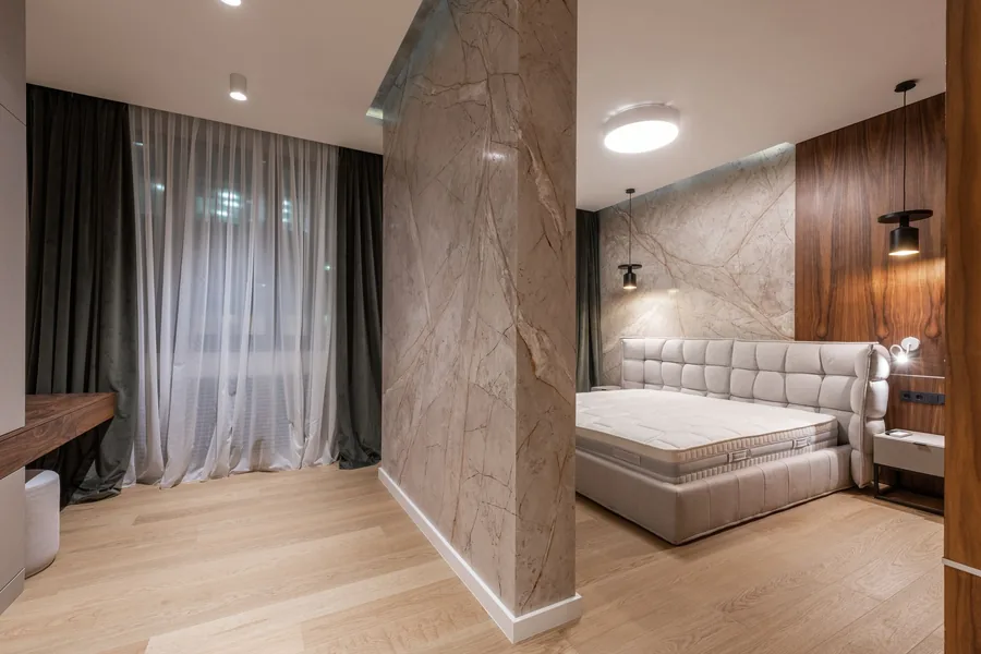
Conventional minimalism removes things. Warm minimalism removes things and then puts depth back — through grain, weave, stone and shadow. The discipline is in the editing; the warmth is in what survives the edit. A room with four materials and no ornament can feel richer than a room with twenty objects, provided those four materials are honest and well lit.
This matters particularly in Indian homes, which tend to hold more life per square foot than the Scandinavian interiors the look is borrowed from. Extended family, festivals, shoes at the door, a puja space, staff moving through the kitchen. A minimalism that cannot absorb that is a photograph, not a home.
Restraint is only luxurious when the few things left are worth looking at.
Building a neutral palette for Indian light
The single most common failure is importing a Northern European palette wholesale. Cool greys and blue-whites are calibrated for weak, cool, overcast daylight. Under the strong warm light of most Indian cities, they read as flat, slightly dirty, and oddly cold at the same time.
Build the palette warm instead, and build it in layers rather than one flat tone:
- A base tone — oat, bone, warm sand or unbleached linen for the largest surfaces.
- A depth tone two or three shades darker, for joinery, a feature wall, or the underside of a ceiling drop.
- A grounding tone — walnut, burnt clay, aged brass or dark stone, used sparingly at eye level.
- One accent, and genuinely only one, usually in textile rather than in paint.
Texture does the work colour used to
Once you strip out pattern and bright colour, texture is the only thing generating visual interest. It has to be deliberate, and it has to be placed where people actually make contact with the room.
Where texture earns its keep
Concentrate it at the touchpoints and at the edges of light. A raw-silk cushion beside a smooth leather arm. A fluted wood panel that catches a grazing wall-wash. A honed stone counter against a matte cabinet front. Texture placed where light rakes across it does far more than texture placed flat under a downlight, which is why it should be planned alongside your lighting scheme rather than after it.
Choosing the substrate matters as much as the surface. The finishes we specify and why are set out on our materials and brands page.
The furniture edit
Warm minimalism rewards fewer, better pieces with visible legs and low visual weight. Heavy skirted sofas and deep dark rugs will fight the look. Leave breathing room between pieces; the gaps are part of the composition. In a combined living and dining space, one long low sideboard will almost always read calmer than two separate storage units.
Three mistakes worth avoiding
- Treating it as a budget style. Fewer elements means each one is inspected more closely. Restraint raises the quality bar, it does not lower the cost.
- Forgetting storage. Visible calm requires concealed capacity. Plan storage first, then subtract.
- Over-lighting. A single bright ceiling layer erases every shadow, and shadow is where the warmth lives.
You can see how this plays out across finished homes in our portfolio. If you would like help translating it to your own rooms, book a free consultation and we will start with your floor plan.
Questions
Common questions
They overlap heavily. Quiet luxury describes the impression — expensive without signalling it. Warm minimalism describes the method that gets you there: fewer elements, better materials, and warmth carried by texture rather than colour.
Warm neutrals — oat, bone, warm sand, clay and taupe — layered in three or four related tones. Avoid cool greys and blue-whites, which look flat and faintly cold under strong Indian daylight.
It works particularly well, because visual calm makes a compact space read as larger. The requirement is generous concealed storage; minimalism fails immediately in a home that has nowhere to put things.
Keep reading
Related articles
2026 interior trends we're actually excited about

A room-by-room guide to layered lighting
Ready when you are
Let's design your excellent room.
Book a free consultation with a senior designer this week — no obligation, just expert guidance and a clear estimate.
Book Free Consultation